
Asurion – 2025
Field App Redesign
Rebuilding the architecture so users have a focused start in the app

The Context
The Field app is everything, everywhere, all at once
The Field app is the mobile tool that over 2300 experts use to manage their day, complete jobs, sell products, and support customers in the field. As new features were added, important information became harder to find, and the architecture needed a more scalable structure.
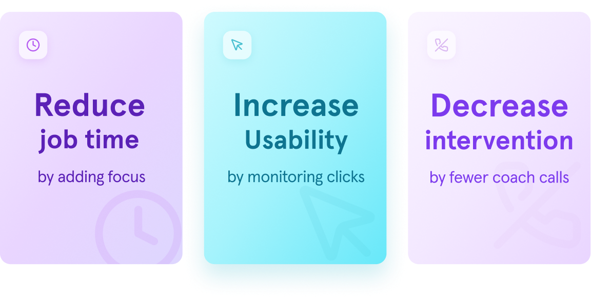
Hidden information and confusing navigation caused extra time for each job, which was causing the business unnecessary dollars.
The Problem
The app was growing, but not scaling
The experience was fragmented and unreliable, and experts struggled to find the right information in the app.
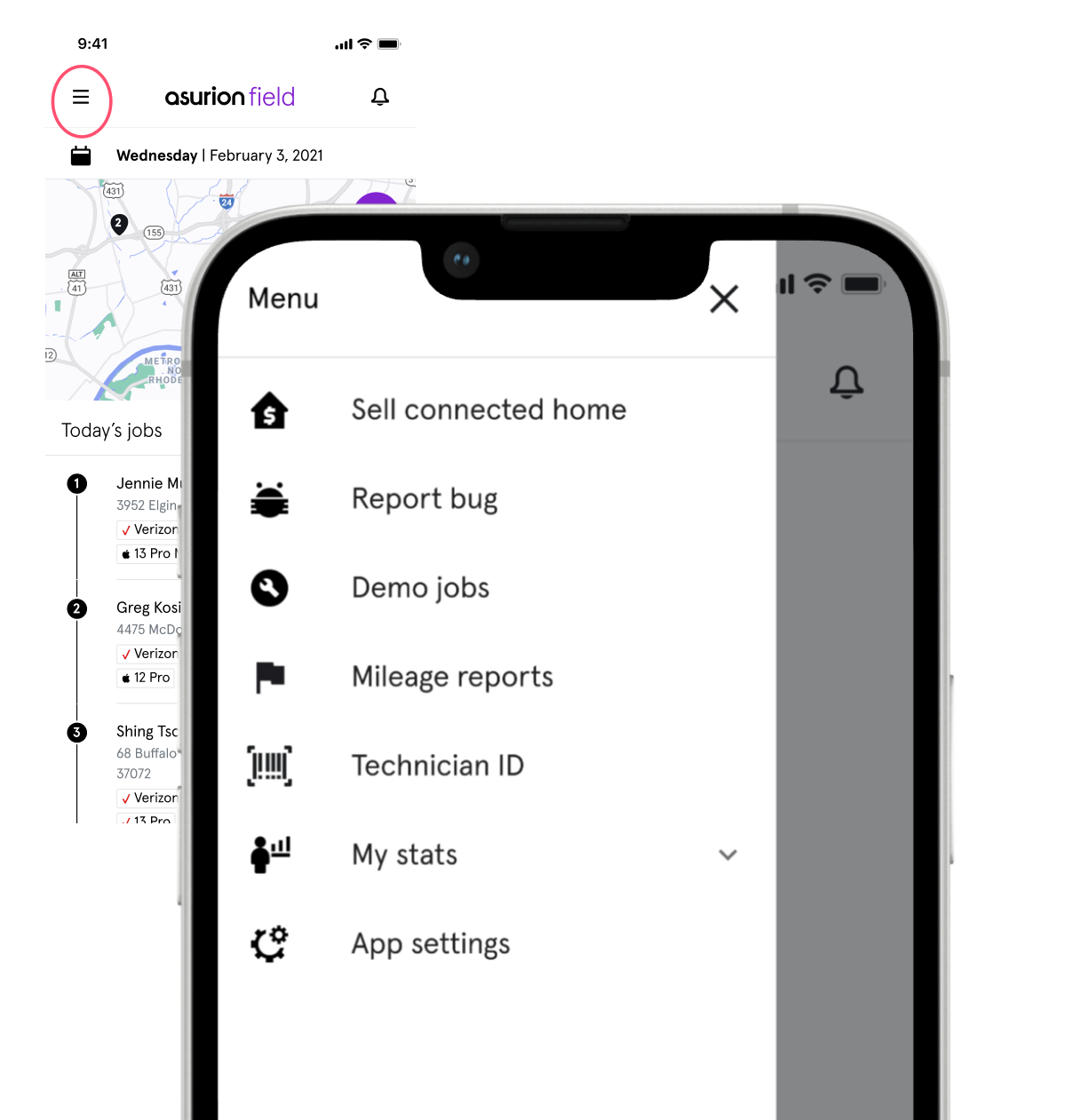
Pertinent information was hidden in hamburger menus and slide outs.
The app opened directly into a job list, with no place to surface daily announcements or information.
Experts needed one landing place to start their day, and new experts needed clearer guidance to ramp up quickly. Top needs were better visibility into their schedule, tasks, and sales performance.
The Approach
Let’s deliver a morning paper for the app
Users did not know where to find information in the app- spending excess time trying to get motivated. From this, the business goal was clear: surface important information, reduce calls to Operations, and create a reusable experience.
What stood out the most was that the work was happening outside the app: experts relied on manual workarounds to share job lists, join huddle calls, and access performance metrics.
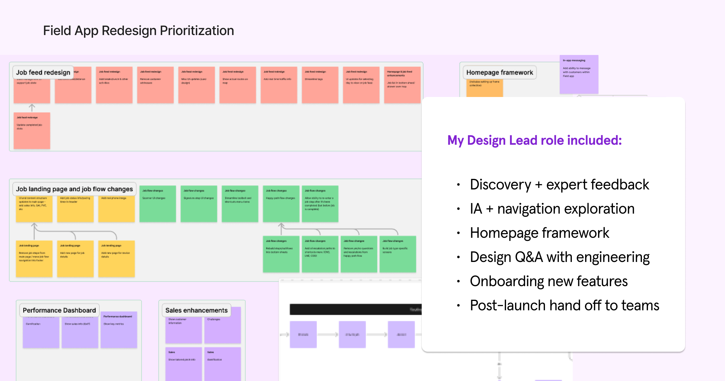
My Role
Design led framework from discovery to launch
My role focused on shaping the homepage framework, exploring the bottom navigation strategy, and designing how performance metrics could become more visible and actionable inside the Field App.
I partnered closely with product, engineering, and field stakeholders to understand expert needs, explore IA options, and review technical constraints. My strength is aligning on user needs and strategy, while focusing on reusable patterns.
Discovery
Real workflows lived outside the app
I led discovery to understand the ecosystem of the in-home job. In order to improve where experts were relying on coach intervention, I led user research to comprehend what information was important to surface.
Following a human-centered approach
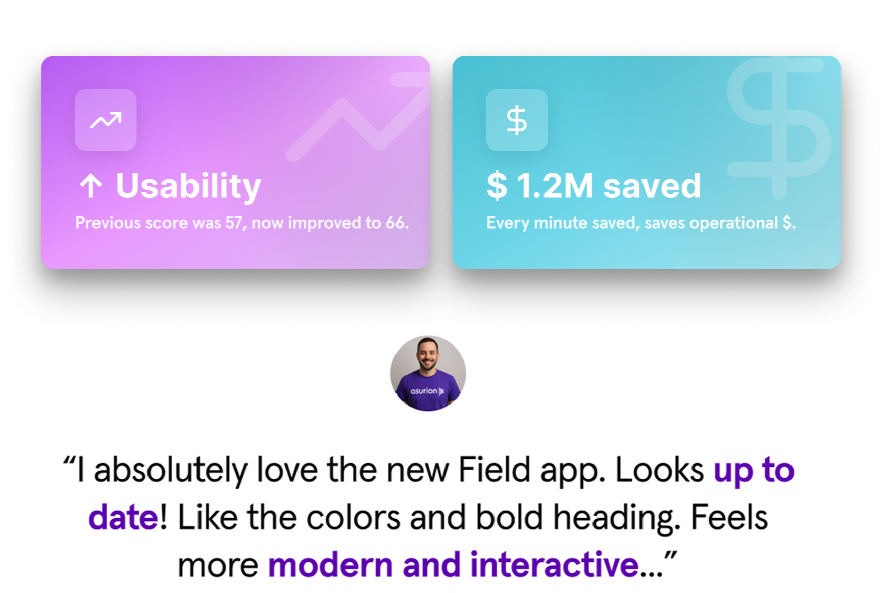
The current usability score was a 57/D; the app had room for improvement. I released quarterly system usability surveys to gather qualitative feedback, and focused on understanding what information would help experts move faster. I aligned teams to focus on the beginning of day inventory and sales opportunities as top priorities.
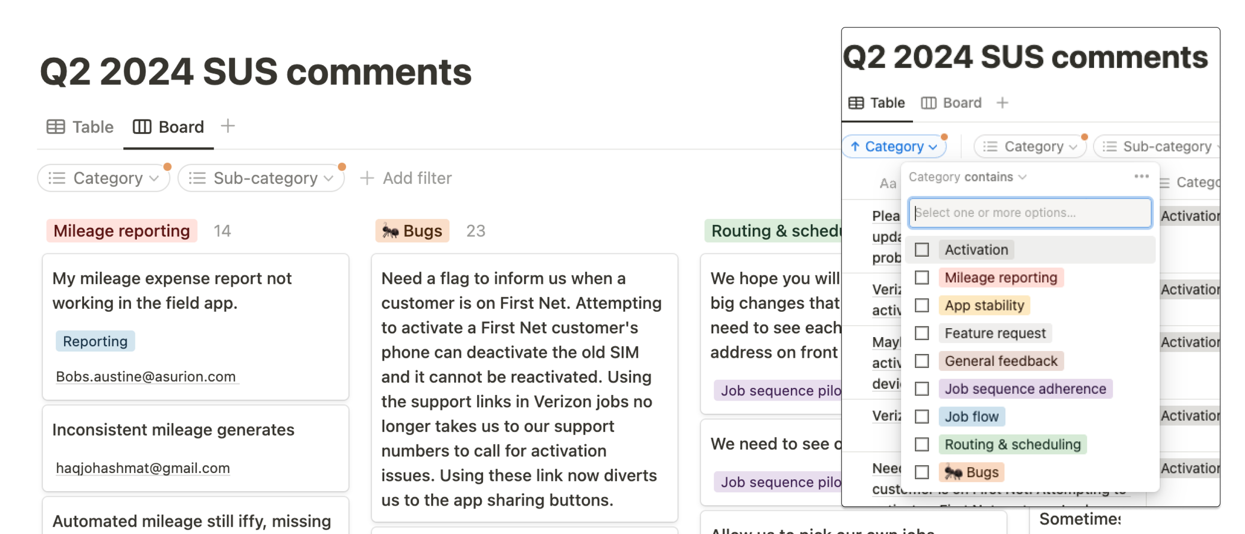
Using feedback to inform scalable architecture
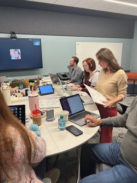
The design process included lightweight discovery sprints with lo-fi prototyping for early feedback.
I led user feedback sessions to validate the new architecture system and identify where the flow still needed attention.
The Solution
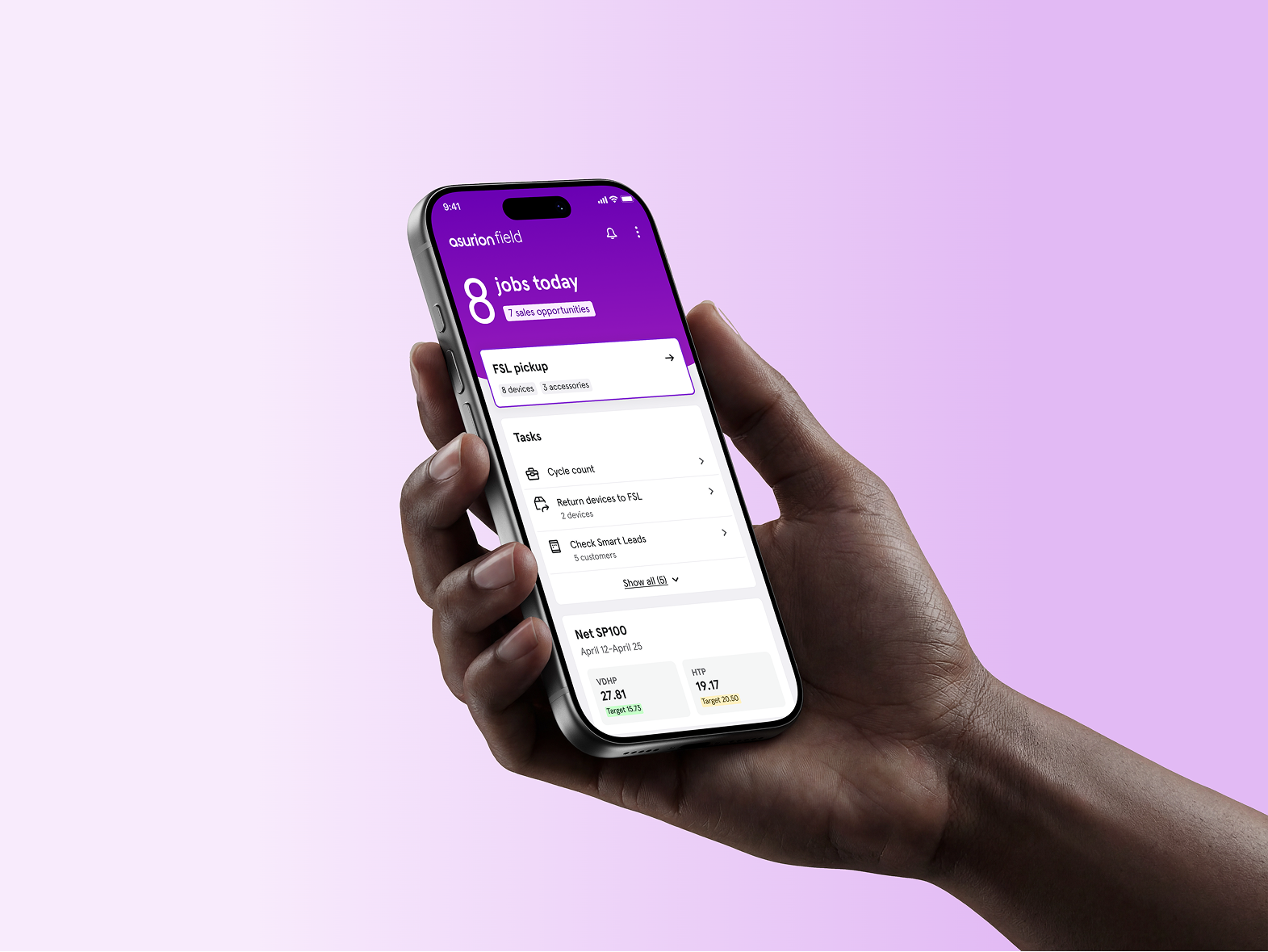
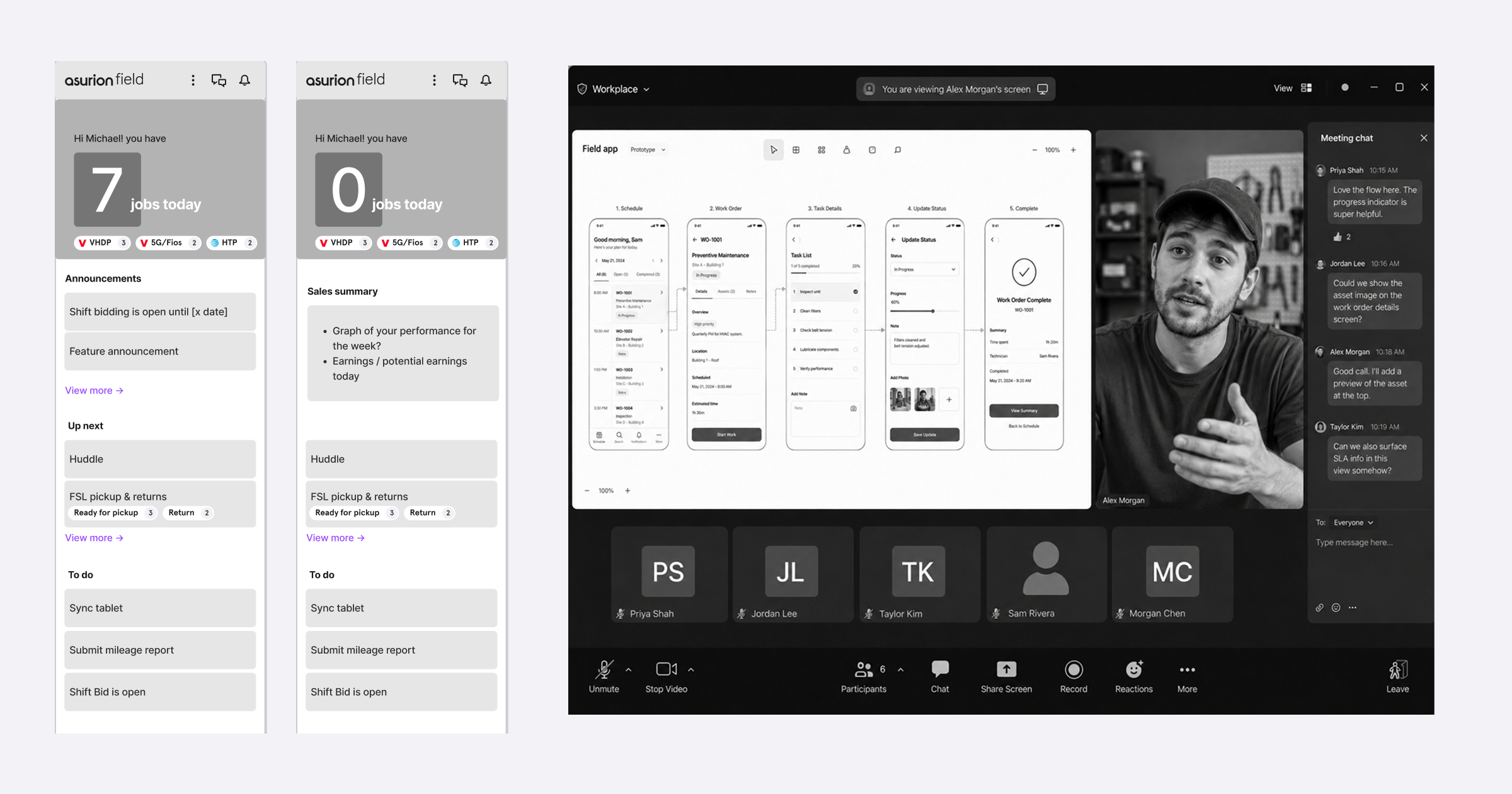
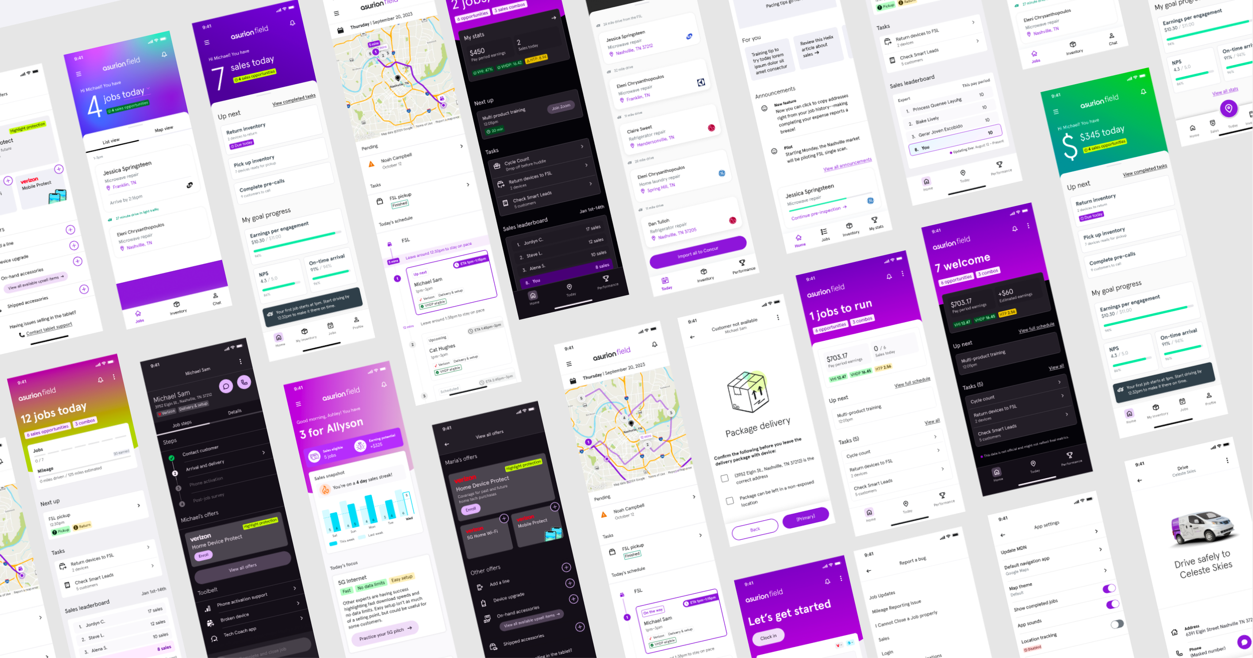
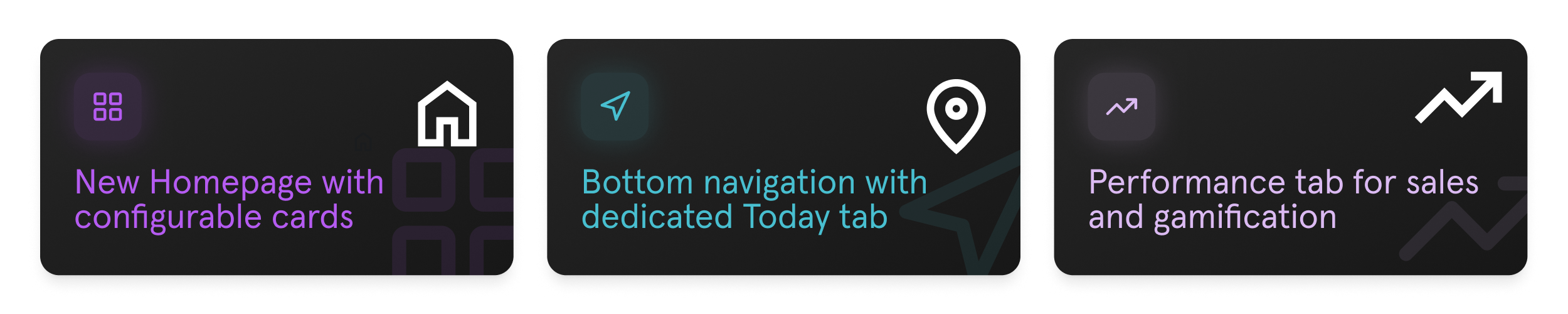
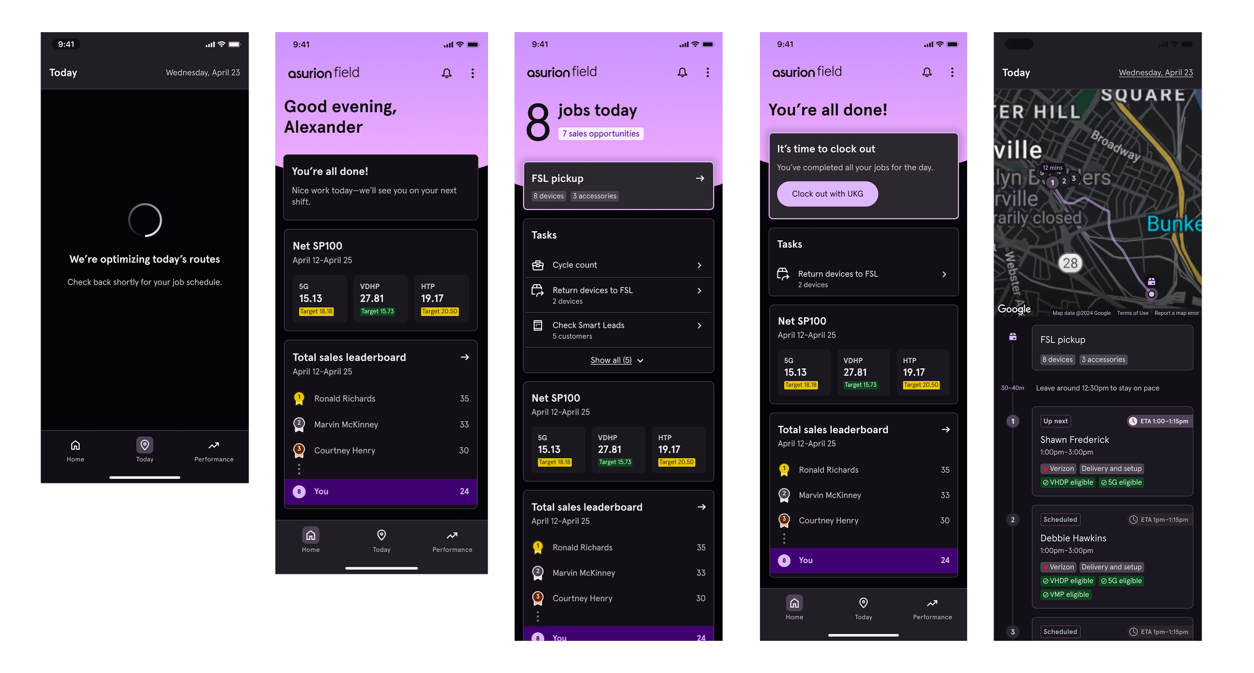
The launch of a new Homepage, Sales tab, and Navigation
The final direction introduced a homepage that centralized high-level daily details, job summaries, and sales metrics. The new bottom navigation gave experts persistent access to the most important areas of the app, while the overflow menu created a clearer home for secondary features.
The design solution provided clear app structure. Configurable card components were reused between Homepage and Performance tabs. With the guiding principle that simplicity is the standard, this structure helped the Field App move away from relying on hidden hamburger menu navigation and created a more scalable framework.
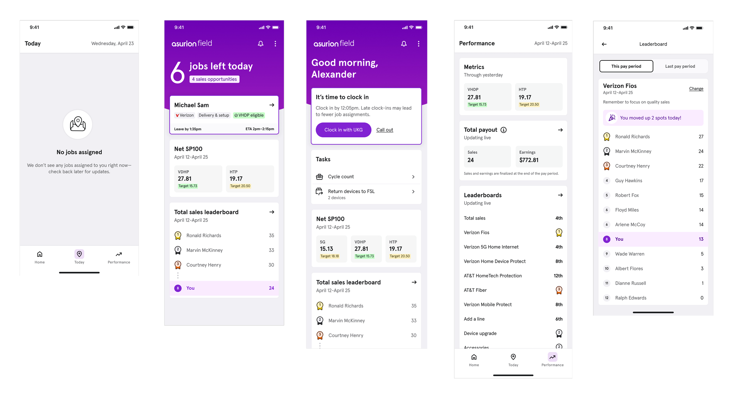
To ensure safety and accessibility, I provided Dark Mode with compatible color tokens.
Onboarding New Features
The goal was reducing onboarding time
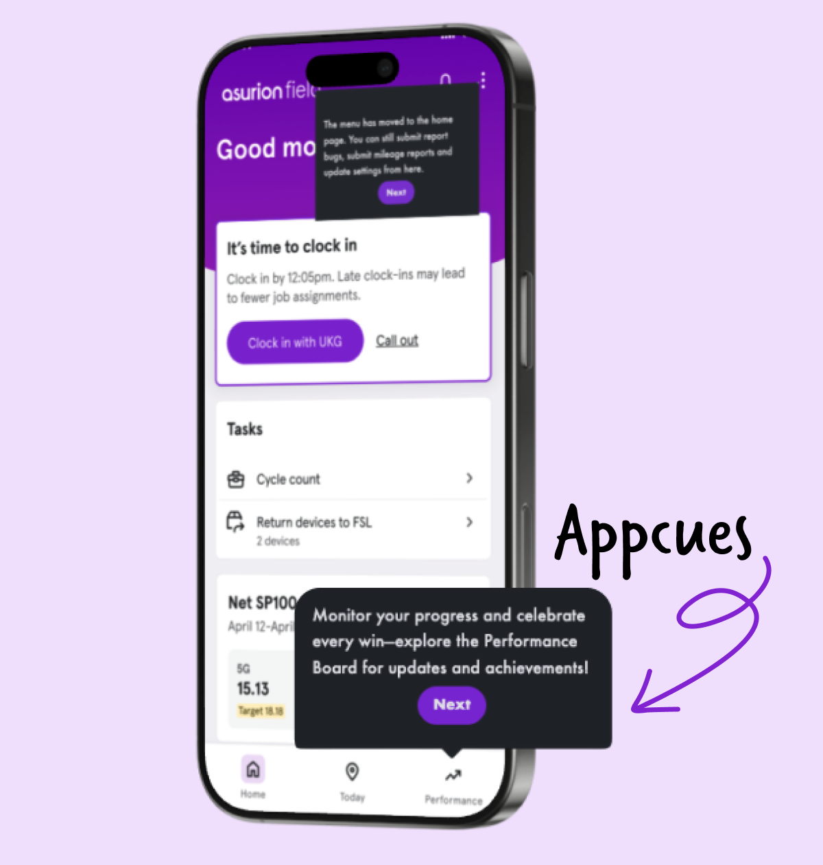
Right on cue… I introduced a new tool called Appcues: an in-app flow that guides users through new features.
Appcues gave designers a way to self-deploy instructions and introduce new features directly in the product without relying on additional engineering work.
I also launched in-app feedback surveys to capture user feedback on specific features, then I maintained the results in a shared dashboard so teams could track themes.
Onboarding time reduced by 50%
The Results
With a new foundation, the usability grade improved
With less manual intervention, the feedback turned positive.
App engagement reinforced the value of new changes.
The new homepage and navigation framework gave product teams a scalable structure for new future capabilities, and saved Operations time and money by being more intuitive.
Experts were more focused on daily tasks:
2% increase for on-time job arrival
Final Workshop + Next Steps
Teams took ownership of next phases
Defining future opportunities and ownership to keep the redesign momentum.
I led the broader team through a workshop to align on future opportunities, open questions, and the next areas of focus. Through prioritization and journey mapping, we determined a focus in gamification, announcements, and AI coaching.
The outcome was a customer check-in experience, an AI assistant for experts, and an in-app training center.
Teams agreed on a shared roadmap and continued support was in place for the entire app redesign.
Reflection
Sooner than later
An honest reflection is that we should have pushed for this sooner, as teams moved quickly once they were committed.
Being an advocate for architecture became a priority. This project strengthened how I think about designing for clarity at scale, and shifted my focus from individual features to thinking long-term and holistically.